

Contents
- Mobile Ads Introduction
- Google-friendliness Update and Mobile-first Index
- Use a Data-Driven Approach to Online Advertising
- Conclusion
Mobile Ads Introduction
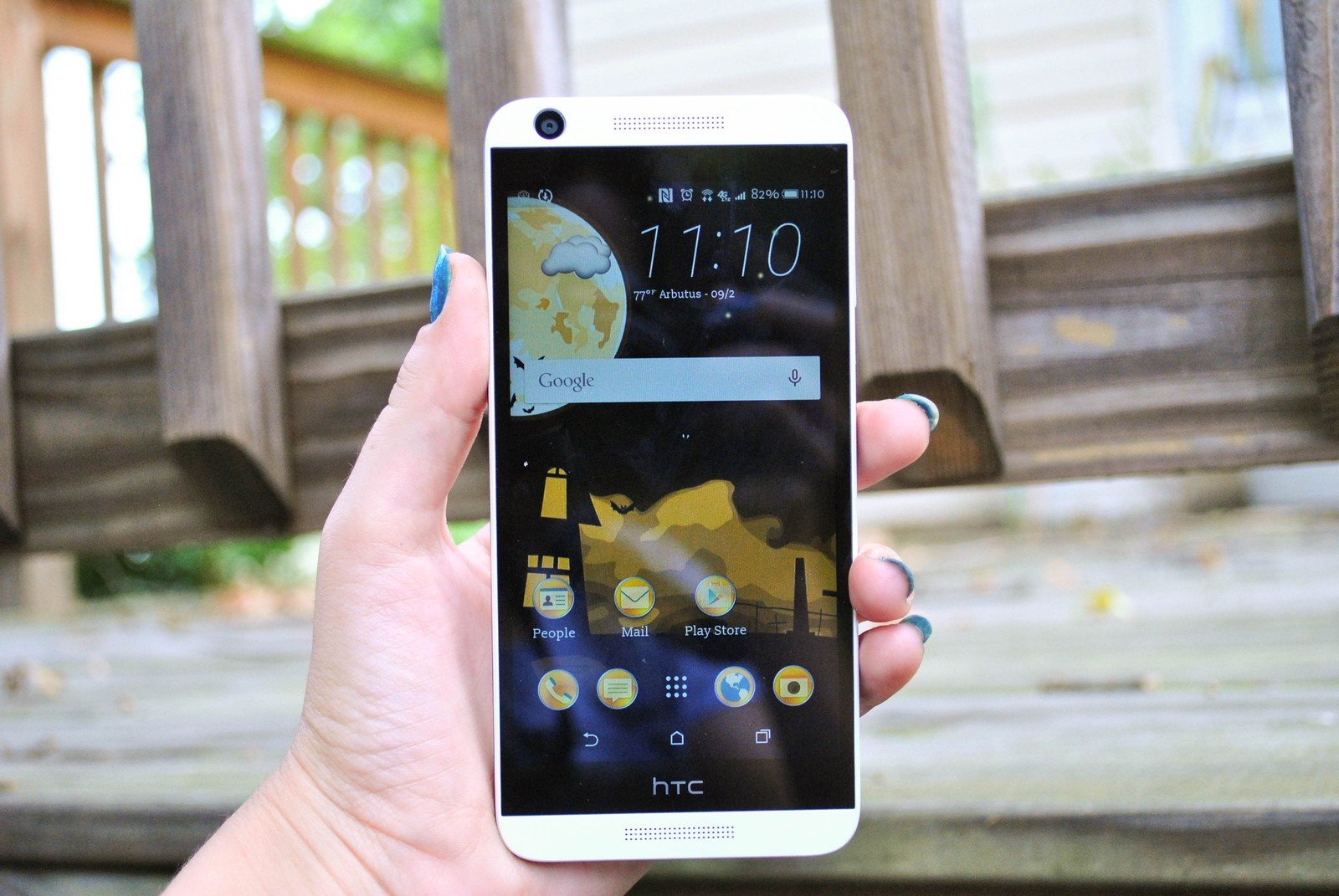
Your customers are mobile, are you?
A large percentage of people now use mobile devices (Smartphones and Tablets) to access the web — looking for relevant information about your business. While they’re on the go, they’ll click on ads and hit a page.
What happens if this page isn’t mobile-responsive? Worse, what if the mobile user landed on a broken 404 page? Oops!
Mobile is dominating in online communications. This is partly because most people are connected via mobile devices. In fact, nearly 80% of Americans own a mobile phone. When it comes to online ads, research by Aumcore shows that mobile devices account for 53% of Paid Search clicks.
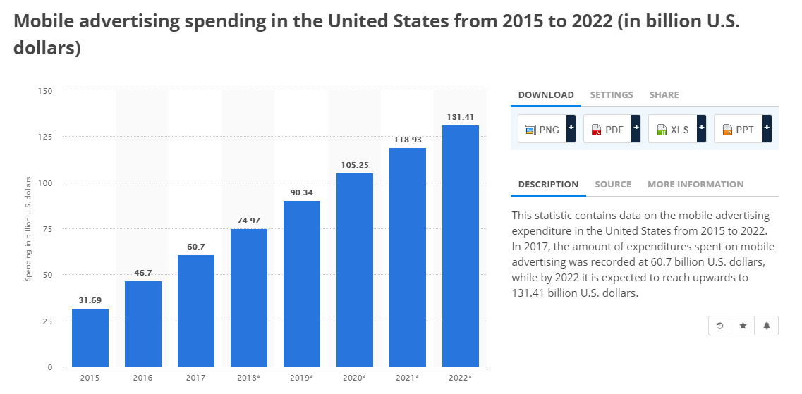
Interestingly, businesses are investing a lot in mobile search advertising. It’s estimated that US mobile search advertising will reach $25.11 billion in 2018 and $131.41 billion by 2022.
You need the right landing page to convert your mobile audience into customers. You can use our own in-house professional landing page builder to build a high-converting landing page for mobile ads without having to write codes.
It’s that simple.
Several studies have shown that websites that are mobile-optimized generate 5% or more increase in your conversion rate.
Google-friendliness Update and Mobile-first Index
Also, You witnessed the launch of Google Mobile-friendliness Update (sometimes referred to as Mobilegeddon) that affects sites in the search engine rankings.
This makes you research further on how to create responsive landing pages that can accommodate mobile traffic. But then there’s a problem. Conversions.

Even after making use of a responsive template, you still notice that your visitors quickly bounce off your landing page like a ball. You’re not anywhere close to your forecasted conversion rate for your mobile ads.
What about Mobile-first search? It’s a fairly new concept that Google introduced to checkmate mobile version of any website before considering the desktop version. In other words, Google now serves the mobile version of your site to users.
Imagine if your site isn’t mobile responsive and properly displayed on different mobile devices no matter the screen size. You’ll be losing prospective customers and sales.
You are already aware that mobile phones are distracting enough so you make your call-to-action button just big enough for the human finger to click conveniently. However, there is a deeper rooted problem and it’s the expectations of a mobile user.
Ultimately, it’s only possible to do so much in the very limited space of a mobile device.
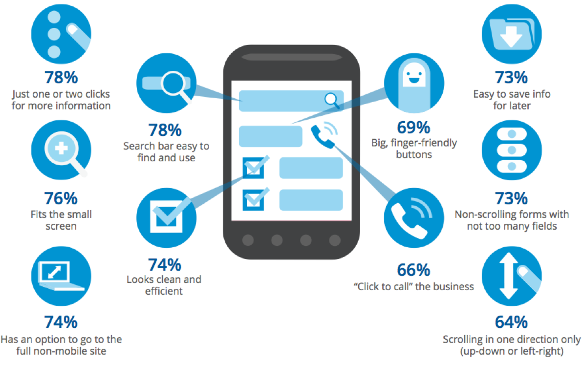
Visitors can see a small volume of information at a glance. According to Marketing Land, about 76% of information fits the small mobile screen and 74% can decide to go to the full non-mobile site.
So, you need every word and element on your mobile ad to be powerful.
For Mobile Ad advertisers out there who are concerned about their ad performance, they can’t seem to figure out what’s causing such terrible conversions. (They could swear that their CTAs are properly placed).
There are online advertising experts giving advice on ways to increase mobile ads conversions.
But wouldn’t you rather prefer that the motivations and anxieties of a mobile user could be broken down?
Or let’s put it like this…Wouldn’t it be great if I could give you a quick checklist that can help you to create a high-converting, mobile-optimized landing page for your mobile ads? Yeah, thought so.
Use a Data-Driven Approach to Online Advertising
This is so important because data gives insights into your industry or specific campaign you’re running. Don’t just run mobile ads with the hope of getting huge results, you should pay more attention to data.
In the words of David Oragui:
“Advertisers increasingly want empirical data regarding the ad buying process, such as where ad dollars are spent and who ends up seeing those ads. Many experts expect a shift in ad spend to more private platforms (e.g., Facebook, Google, Twitter) that can better focus on contextual targeting and direct engagement with social media.
Contextual targeting allows marketers to place their ads precisely based on fine-tuned demographics and/or psychographics. This data-driven approach targets the right ad to the right person at the right time.
The practice of hoping for display ad impressions based upon basic location data and browsing history is no longer sustainable.”
In the rest of this guide, in this article, I’ll show you the 5-Point optimization framework for a landing page that would meet the expectations of your targeted mobile customers.
1. Communicate clearly with mobile customers
Can you communicate with your mobile target audience clearer? Mobile users are always on the go. They don’t have enough time to listen to you if you don’t value their time.
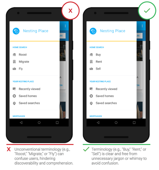
You should you respect their time by communicating your message in a clear manner. Don’t use unconventional words or terms on your mobile ad or landing page.
Instead of using the word “Roost” which most people using expensive smartphones are not even familiar with, you should use “Buy” to quickly connect with your customers. [source]
Remember that every word is vital on mobile devices due to the 6-inch screen size or less. However, if you have a complex product, you may have also come across advice to handle all the objections your customers would have. That would certainly require more space and words.
Research has shown that an in-depth article of about 1,382 words converts up to 7.6% better than a shorter version of 500 words.
Nevertheless, this is not always valid for mobile landing pages. Because a smaller volume of the information can be seen in one glance on the screen.
And, as the user scrolls down your page, their limited functioning memory comes into the scene. In addition to this, the average mobile phone session is barely 72 seconds. So, your visitor will certainly not scroll through 12 pages.
Your first step would be to perform an analysis of the exact keywords your visitors use to find your ads. This will help you estimate the current state of your users in the buying cycle.
If you’re of the opinion that web surfers on mobile devices are mainly in the research-phase, and just want to browse through what you offer, then you may be wrong.
For the plethora of shoppers, mobile phones are fast becoming the go-to device for online transactions.
After identifying the factors that hinder your mobile ads conversions, it’s time to work on your landing page.
Also, ensure that you don’t remove your landing page basic elements that help to establish your credibility. For example, social proofs in the form of testimonials/reviews.
Aside from these, let me address some common mistakes that are prevalent on mobile landing pages:
1. The use of loose and filler words such as ‘best’ or ‘very’
You could certainly be the best French restaurant in California or you could be lying.
What makes your customers able to distinguish your business from the pack, continue engaging with your mobile audience.
Show the number of customers you’ve had the privilege of serving and the amazing experience they’ve had. It’s more convincing and meaningful.
Do not underestimate the effect one word can have on the result of your landing page.
According to Econsultancy, Veeam software experienced a 161.66% leap in their click-through rate from a 1.40% by simply changing their call to action button from ” request a quote” to “request pricing”.
So, get rid of those unnecessary, weak, and flabby words from your landing page. You’d be amazed at your results, so either the word is delivering value or it should be cut out.
2. Lack of Clear Value Communication
You need to be able to address the pain of your customer and convey your offer at the get-go.
And, you do not need to be told how important the call to action and headline copy is with regards to clear communication. But as the experts say passing across your value is not limited to the words you decide to use.
Optimization of your landing page also gets down to its visualization. You need to be certain that the fonts you use are size legible. This is a requirement if you want to build high-converting landing pages for your campaign. (source)
Also, that you are not making use of numerous fonts as this hurts your user’s eyes. Do not expect your mobile visitors to zoom every word on your landing page in order to read it’s content.
Only a few visitors will read a page with small fonts. So your fonts need to be optimized for your mobile audience. It’s recommended by Google that you choose a 16 CSS pixel font size.
You can have the font size of your H1 and H2 adjusted as well.
Lastly, with regards to helping you effectively communicate your message, bullets are excellent tools. You should use them more often.
As they make your pages cleaner with proper spacing, you also ease your customer’s cognitive load — allowing him/her to make decisions effortlessly.
The mistake a lot of business make when using bullets points is conveying features instead of benefits.
Keep in mind that your users skim the content. They are not interested in what your product will do for them or help them to achieve. Simply let them know how it will impact their business, health, life, or the challenge they’re battling with.
Convey customer benefits instead; “sell the results, not the product, Jay Abraham.

Bullets are excellent solutions for simplifying your message. Not only will you conserve space but your customer will have a bird’s eye view of what you offer. Don’t be overly concerned about word count or length of your bullet points, just focus on the quality.
Focus on providing relevant content. If you use the tips I stated above in presenting your value, you’ll keep your mobile customers happy.
Pro Tip 1: You might want to consider creating different landing pages depending on the source of the traffic.
Pro Tip 2: If you have a long landing page that requires scrolling, do not forget to assist your customers with scroll cues. This is vital because if it doesn’t look like they can scroll down they probably wouldn’t.
As usual, don’t expect your visitors to carry out the desired action such as scrolling down automatically. Tell them to read on…
Adding a hint to the user’s eyes, indicating that more content is available by showing them a peek at the next session or providing a directional guide arrow is extremely helpful. Otherwise, they’d just click the back button on your landing page which would be much easier to do.
3. Do you Expect your Users to Fill 10 fields?
Just imagine you clicked on a mobile ad on your device as it caught your attention. It’s the first time you’ve ever heard about a tool like this. But as soon as the website loads, you see a form with 10 fields.
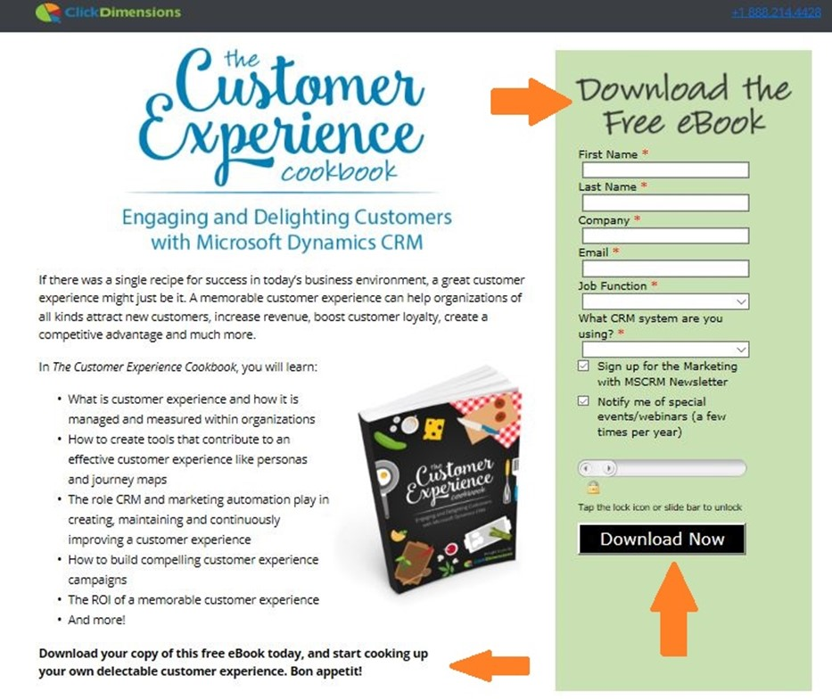
You’re supposed to fill in the fields of this long form from your phone. What would you do? “No. I’ll pass” and you exit.
Expect that your customers do the same. It’s understandable that extra effort is required from your end to call or mail prospective customers to get valuable data from them.
However, remember that the mobile medium is distracting. Users will not have the time or brain capacity to fill long forms.
Here are some tips for optimizing your mobile form to increase conversions:
i). Do not intimidate the customer
Possess the mindset of an essentialist and only solicit for your visitor’s email address. Your mobile ad visitors will be glad you rescued them from the mental stress and physical effort.
Besides, when people visit your website, they don’t have enough time to even read the content, let alone fill out numerous form fields. It’s never been a good experience for online users — don’t reinvent the wheel.
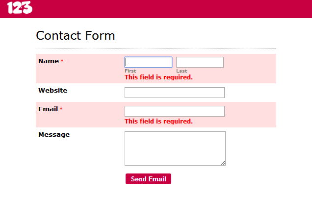
That’s why a form that asks for first name and email address is all you need.

If they loved your product, they’d gladly fill out any long form and supply all the contact information you want. But first, serve them well.
ii). If the number of fields can’t be compromised, then allow autocompleting
Safari and Chrome support it — if your visitor has it activated on their iPhone settings. For permitting auto-complete in your email field, a simple HTML code will activate it.
You could also opt for Smartphone features such as GPS, camera, contacts, and voice to fill out the fields for your users.
iii). Eliminating Form Field Space
A great hack to eliminate the friction of completion in long form fields is by removing the space separating them. By doing this, the form will seem shorter and the customer won’t consciously have to scroll down in order to enter data.
It’s true that sufficient space is required for convenient typing when using mobile devices. I only recommend that you find the best balance.
iv). Use of Error Messages
Suppose your visitor gets interested in your product and begins to fill your form. And then makes a mistake in the process. How can you ensure the experience stays delightful for the user and get them to finish up?
You can encourage completion through error messages that indicate clearly the error committed by the visitor.
Recall how I informed you about proper spacing between form fields? Well, placing images, fields, and buttons can harm your conversions.
You’re designing your landing page for thumb touch and not pinpoint mouse arrow. So if your landing page causes fingers to land in tje wrong area, it needs to be redesigned.
vi). Ignite your Users Passion in a Seconds
How much information does your landing page form requests?
Your elegant page has been crafted with what plethora of design elements? Every single element affects your page’s performance. And it pisses off your visitors. This gives them the easy choice of getting off your page.
As a matter of fact, 43% of mobile visitors are unlikely to revisit a landing page that loads slowly and 85% of users on a mobile device expect the load speed of your page to be faster than a desktop.
There are various ways to decrease your page load time. One of which is leveraging browser caching but it’s a huge investment and on mobile pages may cause issues when not properly implemented.
As an alternative, you would need to put the localStorage HTML specification to use or even rely on mobile acceptation automation solutions.
The Internet is visual dominant and will require you to serve High Res. Images on your desktop page. However, for a quality mobile experience, you would need to reduce the image file size and trim the resolution.
Here are some tips on image optimization:
a). Pick the relevant image format
JPEG is typically the best because most browsers support it. PNG is great to use, however you should avoid TIFFs and BMPs like a plague.
b). Utilize Image Editing Tools
If the width of your page is 600 pixels, then you need to crop your visuals to resize them appropriately. Do not put up a 1500 pixel image and place the parameter of the width to 600.
c). Compress Pictures
There are plugins if you use WordPress, for example, to compress images without affecting the quality.
d). Get Rid of Irrelevant Image Metadata
It’s pretty obvious that unnecessary info used by most digital cameras in the form of EXIF data would lead to increased load time. You can make use of Exif.er to have your images data edited before upload.
This helps to improve the speed of your website by stripping out unnecessary information.
Also, in your Google Analytics under network, you can check the connection your visitors are using to gauge the appropriate speed of the landing page. If they are using 2G or 3G, your page needs to be very fast.
4. Don’t Expect Your Visitors to Carry out More than One Action
On a mobile landing page, convincing your visitor to take one simple action takes a lot of effort. Now imagine two.
Requiring customers to learn more and share the offer on a mobile page isn’t a smart move. Every word. Image, action button, and other elements on your page need to converge towards the goal you have — Conversions!
So what are the best ways to boost your CTA’s conversions?
- Create a visible CTA button with a compelling copy. Ensure it’s at 44 pixels in width at least.
- The CTA button needs to be of a contrasting color to the background page. Same colors with the background are a terrible blunder.
- You have to constantly remind your users of your offer seamlessly and nudge then to your conversion goal as well. This is necessary for a long landing page. A recurring CTA button will further get the user to opt-in to your email list or buy the product.
- If you must use two CTA buttons, then ensure that the primary one is above the secondary button. This will create a mental effect of importance in the mind of the visitor
Conclusion
Creating a landing page that will increase your mobile ads conversions involves testing both your landing page and the ad to determine the best.
At the end of the day, it’s all about optimizing your landing page. Study your market so that you can understand your audience better. This helps you to communicate clearer, better, and in a persuasive manner.
Then, simply provide them with a relevant dose of data based on their intentions. No more and also no less.
I certainly hope that this article on how to power your mobile ads with high-converting landing pages has created new possibilities of generating the most leads and sales from your online ads.
I’d recommend getting started now. Just pick one element of your landing page with low conversions and start split testing immediately.
You can certainly expect a higher conversion rate from your mobile ads in the future if you implement the best practices and stay consistent.