

Contents
Setting the Ground for Landing Page
Your landing page is the perfect tool you need to acquire more qualified leads and increase your sales. In fact, it could transform your business if you know how to leverage its awesome potentials. And that’s exactly what this in-depth landing pages optimization guide is about.
When it comes to growing leads and sales, there are no fast rules. However, there are specific steps that you can take to get the best results. Improving your landing page conversion rates by an additional 1% could lead to more leads and revenue.
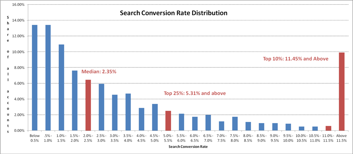
According to research by WordStream, the average conversion rate for a landing page is 2.35%. The top 25% of pages convert at 5.31% or higher while the top 10% have conversion rates of 11.45% or higher.
How do expert marketers achieve far better conversions than everyone else? It’s not because they’re smarter than the rest of us.
It simply because they know how to use the elements of a landing page to convince visitors to take the actions they want.
Having said that, you’ll find that even for the best marketers, there’s still an untapped opportunity for improvement. It’s vital you find this room.
In the words of Peep Laja, founder of ConversionXL:
“Good landing page = good ROI. Crappy landing page and you have just (needlessly) wasted your money.”
In this guide, you’ll learn what you need to know to build a landing page that will motivate your visitors to fall in love with your offer and take the necessary action, such as subscribing to your email list, downloading your ebook, or buying your product.
To get you started, let’s get the basics out of the way.
What is a Landing Page?
A landing page is a standalone page on your website designed to attract qualified visitors and persuade them to take your preferred action. This action could be to give you their email address to become leads or make a purchase to become customers.
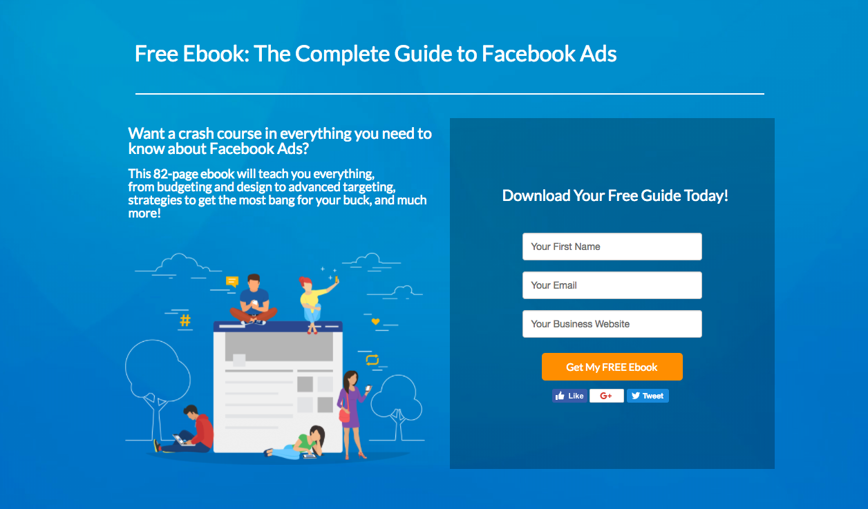
Here’s a good example of a landing page that offers users a free ebook on Facebook Ads.
Generally, traffic is directed to landing pages through search ads, social media ads, and email marketing.
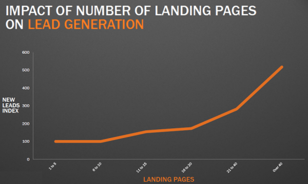
You should have as many landing pages on your website as possible. Jon Simpson from Forbes in an experiment found that using multiple landing pages can increase leads — And when you add videos to them, your leads could increase by up to 80%.
The 3 most popular types of landing pages are:
1. Lead Generation Landing Pages
Lead generation landing pages are the most popular type of landing pages you’ll find. In fact, when most people talk about landing pages, this is the type they’re talking about.
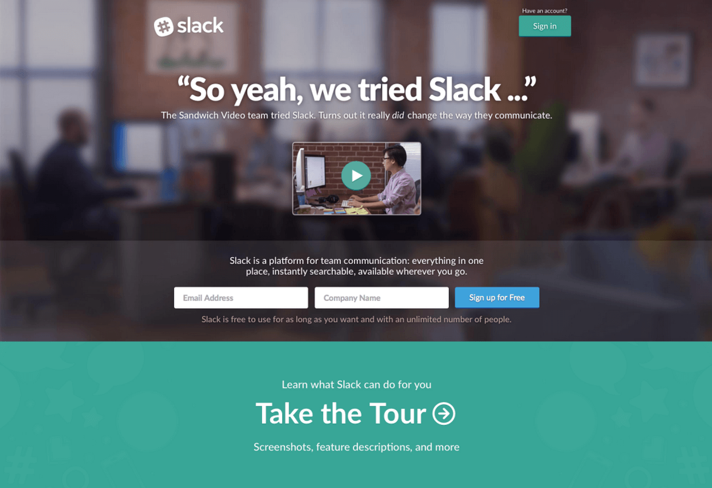
This page aims to collect a visitor’s information which is usually their first name and email address. Here’s a good example of a lead capture landing page that asks the user for their email address and company name only.
In some cases, websites ask for additional information like phone number, company name, address, etc. But this is not common.
Often times, websites give lead magnets like ebooks, whitepaper, exclusive content, video, or a free consultation to encourage visitors to release their personal information.
2. Event Registration Landing Pages
To organize or host an online event, you need to market it to get participants. Event Registration landing page captures email addresses of participants to send them more information about the event and possibly their access codes. This is also a type of lead generation as these people are nurtured in the future or even learn of new products during the online events.
Take a closer look at this event registration landing page:

3. Sales Landing Pages
When all is said and done, you want to sell a product or service on your website. Hence you need a sales page. Sales landing page is the page where leads can get pricing, specifications of your product or service, and pay for it (if they’re convinced).
Although not every website visitor will get to this page, you want to get as many people as possible there.
If a sales page highlights the benefits of a particular product and offers a money-back guarantee, then it’s bound to perform well — all things being equal.

With a landing page, there’s an urge to do as much as possible to convert your visitors. Include as many elements as possible. But you need to stop.
When Leonardo Da Vinci said, “simplicity is the ultimate sophistication,” He was opening our eyes to the reality of opting for less instead of more. You should always aim to make your page as simple as possible to convert visitors.
When building your landing page, you must take these 8 optimizing factors into consideration:
1. Define the aim of your landing page
When creating your landing page, define clearly what you want your landing page to achieve. This helps to set the tone of the elements you’ll use on your page.
The landing page below has a clear Unique Selling Proposition (USP). That’s the aim! It’s clear that only prospects who are interested in getting a Home Loan would fill out the form.
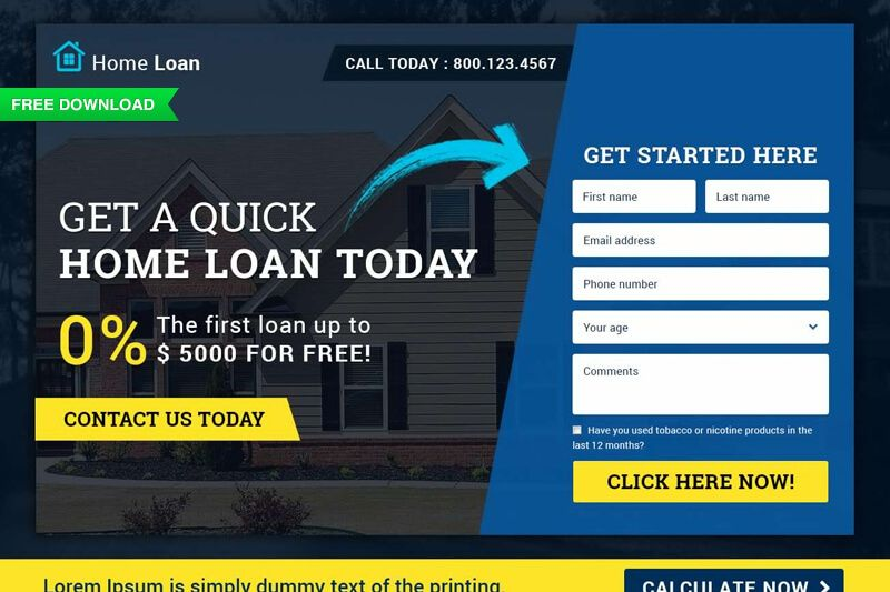
Without a specific aim for your landing page, your page will lose focus and fail to capture leads or sales. Do you want to capture email leads for an email marketing sequence, or to register for an event?
Is it purely to sell a product? You need to define these before creating your landing page.
2. Craft an attractive offer
To achieve your aim, you need to give a compelling offer to your landing page. Nobody is going to give you their personal information or money without a reason. And that reason has to be good.
Not necessarily to you, it’s all about your audience.
In other words, when you have a product or service to sell, making an offer is the easiest way to hone that message better. Your offer will help the customer to know:
- What you’ve got.
- What they stand to gain.
- What you’re asking in return.
Brands have really improved in their offers. Imagine Dotti, and ecommerce brand offering a pair of Denim Jeans and Shirt for free when a customer buys a pair. That’s impressive!
One of the questions to ask in your offer is: Is it good enough for your visitor? If it’s not, then it’s unlikely to achieve your aim. Your offer must always show benefits to your visitors.
Many times, the benefits have to begin on your landing page with a lead magnet or a coupon code. With this, visitors get a benefit they can exchange their personal information with.
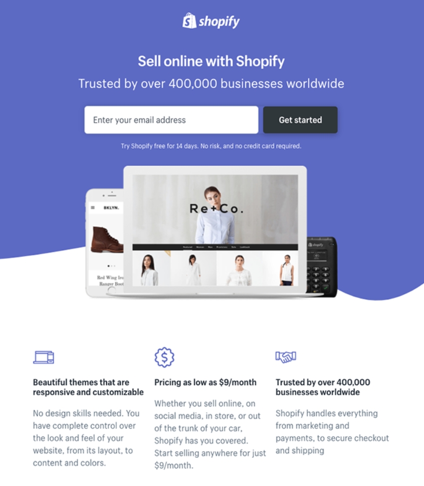
This is an example of a landing page by Shopify that shows an attractive offer to a visitor and even social proof.
3. Create a simple landing page design
One of the key factors that could make or mar your landing page is its design. Your landing page design is usually different from a general page on your website. Your page design is aimed at converting visitors to take your intended action.
Every design element, color, font, background, is picked with the aim of converting visitors. It’s as simple as that.
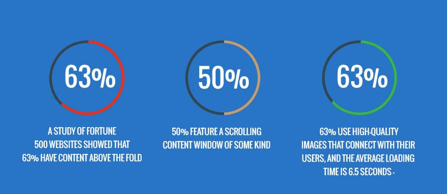
More importantly, make sure you utilize ‘Above the fold’ section of your page. Include the most important elements of your page there, according to a study of Fortune 500 websites by Go-Globe.
One major difference between a standalone landing page and your general web page (such as blog post) is the use of navigation bars.
The aim of most of your web pages is to get visitors to visit more pages. To achieve this, there are many links that lead the visitors to other pages.
However, for a landing page, the last thing you want is for visitors to navigate away from your page. Because they will no longer take your intended action.
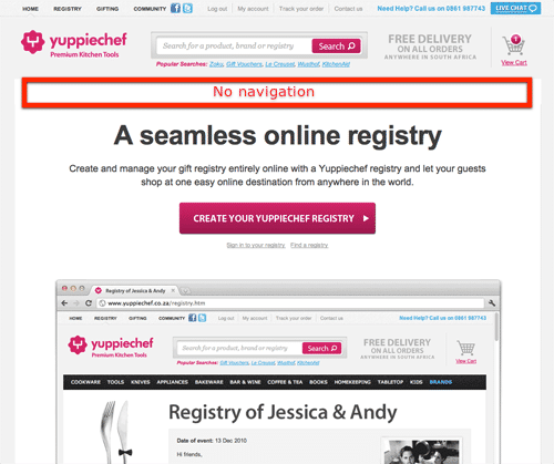
Despite this, only 16% of landing pages are without navigation bars.
On your landing page, you should remove the navigation bar and other opportunities for visitors to navigate away. When Yuppiechef removed navigation bar from its landing page, it led to a 100% increase in signups.
Another consideration to make is the design elements on your landing page that are similar to your website.
Even though there are differences, your landing page must still have your website theme. This would include the color schemes, fonts, logo, and other elements that still identify with your website.
If you’re directing traffic to your page through an ad, then you should consider your ad design when designing your page.
When people click through your ad, they want to see more of the ad design that attracted them. Your landing page design shouldn’t be entirely different from your ad to maintain consistency.
4. Create a clear landing page copy
A poorly-designed landing page sends a negative signal about your expertise. It’s difficult for a visitor to believe in your product when you have a crappy and unprofessional landing page.
To convince your landing page visitors, you need a persuasive copy. Your copy is both the written texts, images, videos, and other elements on your page.
The English vocabulary is large. But whether you’ll get a lead or sale depends on how you use the right words. Your copy must be able to convey benefits to your visitors.
While writing your copy, keep these thoughts in focus:
- You should also understand your ideal lead or customer’s psychology.
- What’s their biggest fear?
- What’s the biggest problem they want to solve with your product?
- How can you help them to solve that problem?
- How can you make their lives easier?
All of these pointers should be clearly communicated in your landing page copy. And this starts with your headline.
The aim of your headline is to get your visitor to read your copy.
As Copyblogger’s Brian Clark said, “the aim of your headline is to get the visitor to read the first line and the aim of the first line is to get them to read the second line, and on and on.”
Your headline must show visitors the benefits they’ll gain when they read your landing page content. Other parts of your landing page copy to pay attention to apart from your headline are:
- The subheadline
- The benefits in bullet points
- An attractive offer
- The Calls to action
- A Guarantee
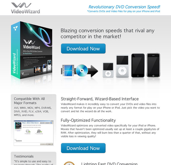
Below is an example of a simple and persuasive copy that explains the benefits of the product in clear terms.
5. Add images to landing page
If you have relevant images that are applicable to your message, you should add them to your landing pages.
However, you shouldn’t stuff your landing pages with too many images as this can distract your visitors from the primary aim of your page.
The best practice is to use a single image or two and no more on your landing page.
Leaving a lot of white spaces can help your copy to breathe properly — and your offer will stand out on the page.
6. Use an obvious call-to-action
You need to tell your landing page visitors what to do. Otherwise, they’ll close your site [x] and leave. This is where your call-to-action (CTA) plays a key role.
Your call-to-action is usually a part of your landing page copy. See your CTA as an unseen elbow that nudges the visitor to take action now.
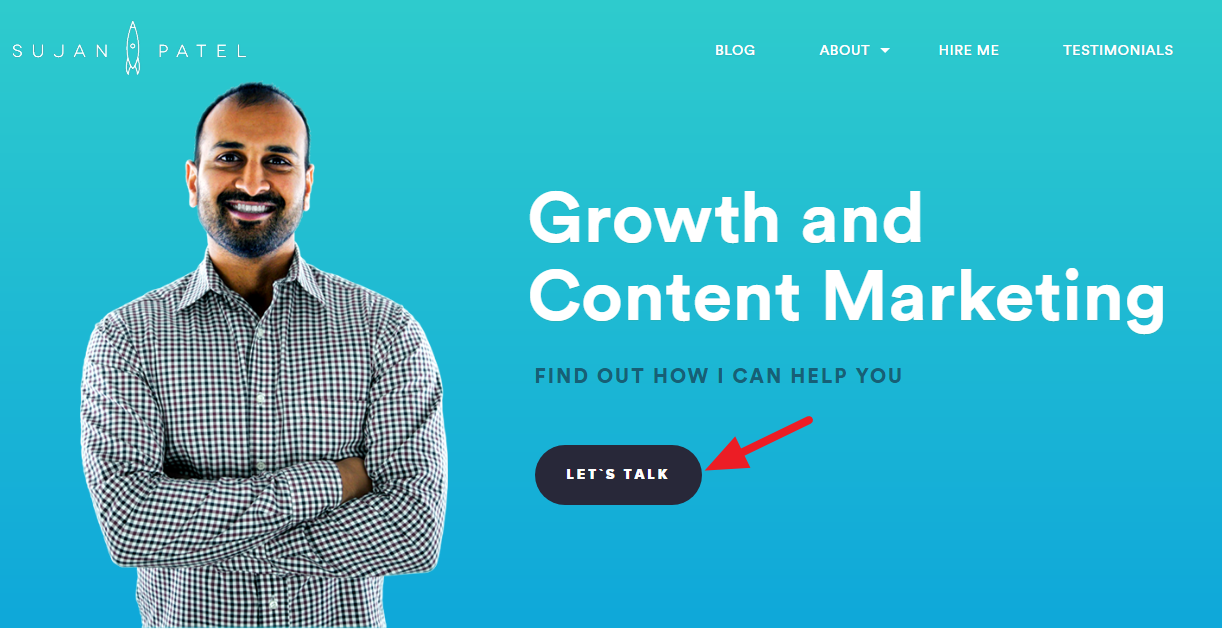
Apart from your landing page, you should have clear and relevant calls to action buttons in various places throughout your website. Sujan Patel, a growth hacking expert uses “Let’s Talk” text on his CTA button. I kind of like it…!
Conversion rate optimization expert, Bryan Eisenberg said, “Calls to action should stand out (think contrast) and be obvious from the moment a visitor lands on your page.”
The point is that you don’t have to wait till a visitor reads your entire landing page copy before they convert. If a visitor is so convinced by your email or ad that they’re willing to perform your intended action immediately, why waste their time?
You should have your calls to action at various parts of your page to make it easier to convert visitors. Likewise, your call-to-action should be above the fold where it’s easily accessible to visitors. Below is an example of such a page:
The words you use on your landing page have an effect on your conversions. In the past, it’s common to use words like “Buy Now” or “Subscribe Now.” But marketers are now more effective with ‘more personal’ call-to-action.
Your CTA should have the benefit the visitor would gain. It can also be related to your lead magnet. For instance, “Get your ebook” or “Book your free consultation” show more benefit to your landing page visitor than “Download now.”
7. Make your landing page mobile-friendly
Today, a large share of visitors to your landing page is on mobile devices. Having a poor mobile page will only increase your page bounce rates and lead to a decrease in conversions.
You should ensure that your landing page is mobile-responsive. All your landing page elements should be accessible on mobile devices. Your conversion rates will also be high if you get most of your leads from mobile users.
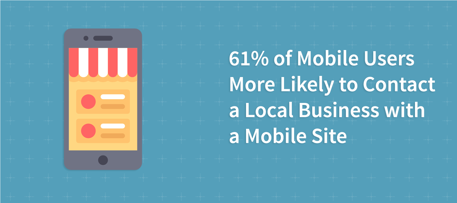
Data compiled by Impactbnd shows that 40% of all mobile users are busy searching for a local business or interest right now. There’s more, BrightLocal found that 61% of mobile users are more likely to search for a local business.
Our landing page builder offers you landing page templates that are mobile responsive. You can also check these pages on your smartphone to see how they display.
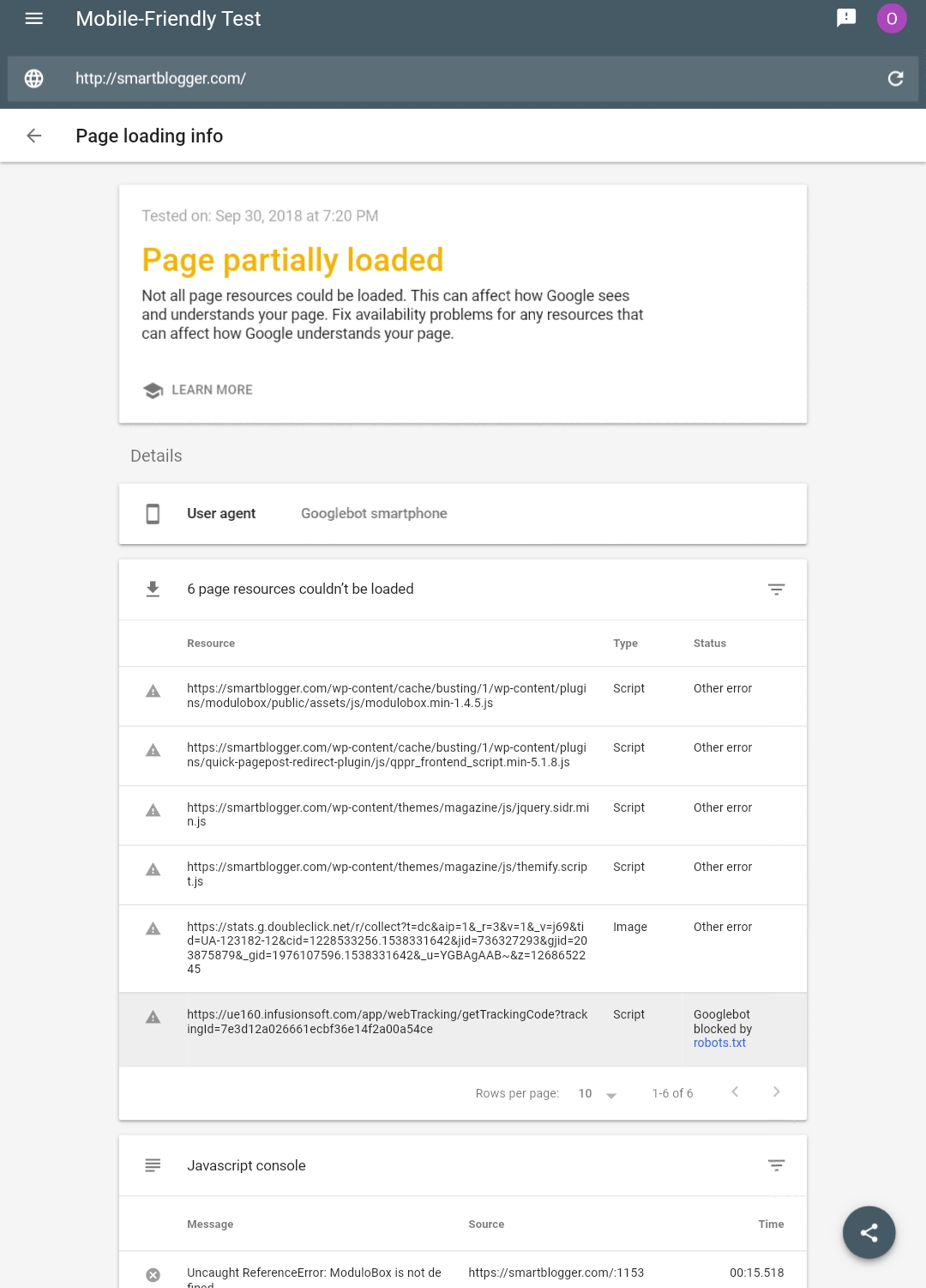
Another way to ensure your landing pages are mobile responsive is to use the Google mobile-friendly test. Enter your landing page address into the tool and click on “Run Test.”
This will show you whether your page is mobile-responsive or not. When you click on “View Details” at the top of the page, you’ll see more changes you can make to your page to improve its mobile-friendliness.
8. A/B testing your landing page to increase conversions
There’s no guesswork when it comes to the perfect landing pages. That’s why you must always test different elements of your landing page in a bid to improve its performance.

A/B testing is one activity that will always be relevant in the digital marketing environment. To carry out A/B tests on your landing page, you decide on an element of your page to test.
After doing this, you make a variation of your landing page with the element changed. For instance, you can decide to test another landing page headline against the control which is your current landing page. You’ll then track their performance over time.
If your variation has a higher conversion than the control (such as the image above), then it means your new headline should be implemented in place of the old headline.
If the old headline has a higher conversion, then you should retain it. One major point to consider when performing A/B tests is that you should only test a single element at a time.
When you test multiple elements at a time, it becomes difficult to know the element responsible for a change in your landing page conversions.
Some landing page elements you can test are:
1. Headline
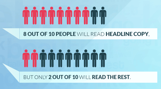
The headline of your landing page is the first part that a visitor sees. 8 out of 10 people will read your headline, says Brian Clark.
A boring or an ineffective headline could see visitors to your landing page bounce away immediately or within a few seconds of landing on the page..
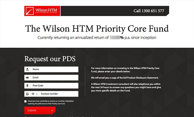
You can test 2 headline variation and track the conversion of each page. An investment group, Wilson HTM, tested a headline against its control landing page. Below is the control:
The second headline tested is shown below:
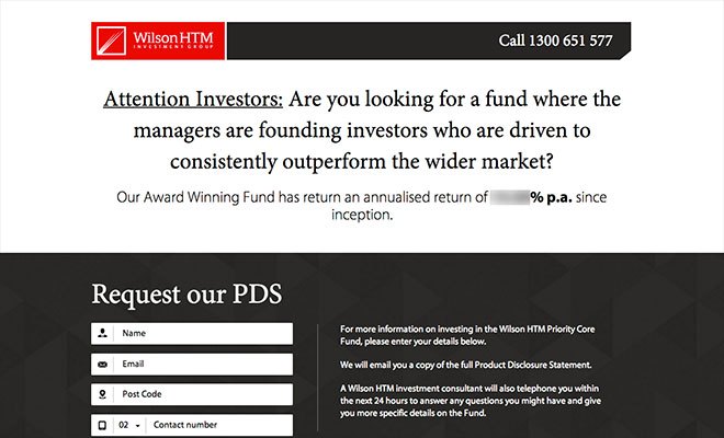
Results showed the variation had a 52.8% higher conversion than the control.
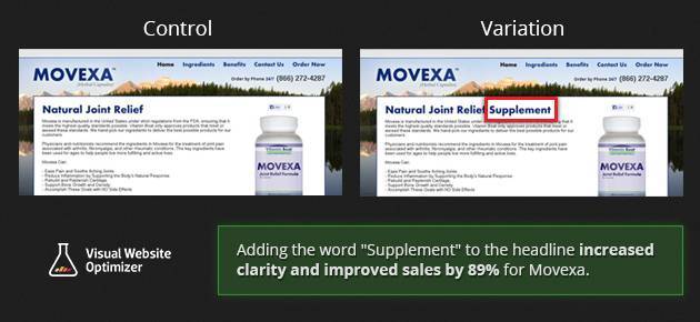
Movexa also tested the headline on its supplement sales page. It created a variation that has the word “supplement” in it. This led to an 89.97% increase in sales for their supplement.
2. Page copy
You should test another page copy to see if you can improve performance. This could have a big impact on your conversions. Two major elements of your page copy to test are:
- Copy length
- Copy style
Even though the convention that most businesses adopt is a shorter copy, your audience might prefer a longer copy. That’s why testing is the only way to be 100% sure.
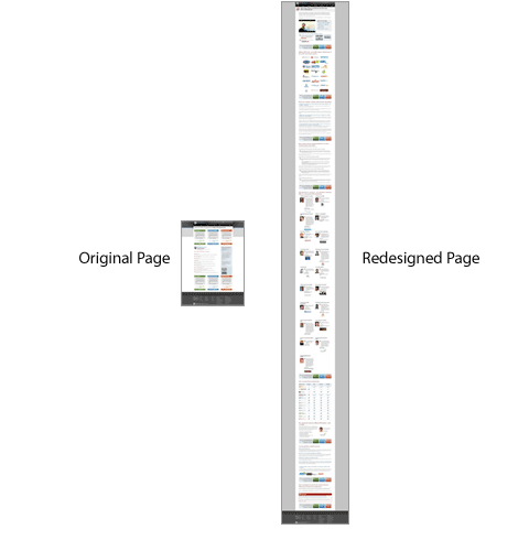
You should test both versions and see what works best with your audience. For instance, Moz increased a landing page conversion rate by 52% when it increased the page length.
Another important aspect that you can test is different styles of page copies to see what your audience resonate with the most.
3. Background
You can also test the background of your page to see its impact on conversions. You can do this in 3 main ways:
- If your landing page has no background, you can have a variation with a background and see its impact on conversions.
- If your landing page has a background, you can replace it with another background and see its effect.
- If your landing page has a background, you can remove it and see its effect.
3. Content type
Yes, the most common type of content you’ll find on landing pages is the written content. But you can get creative. Nothing stops you from using another type of content to see how it affect conversions.
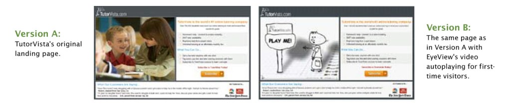
One of the most common is videos. There are landing page builders that’ll offer you templates for a video landing page. When TutorVista.com, an online tutoring company, added a video to their landing page, it led to an 86% increase in conversions.
5. Calls to Action
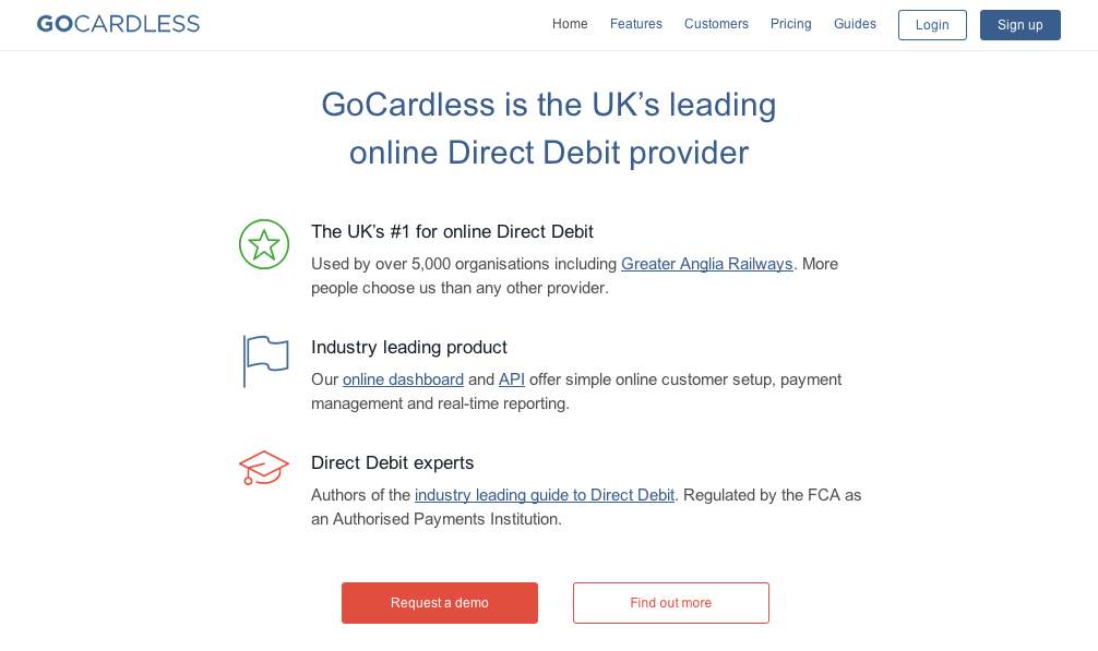
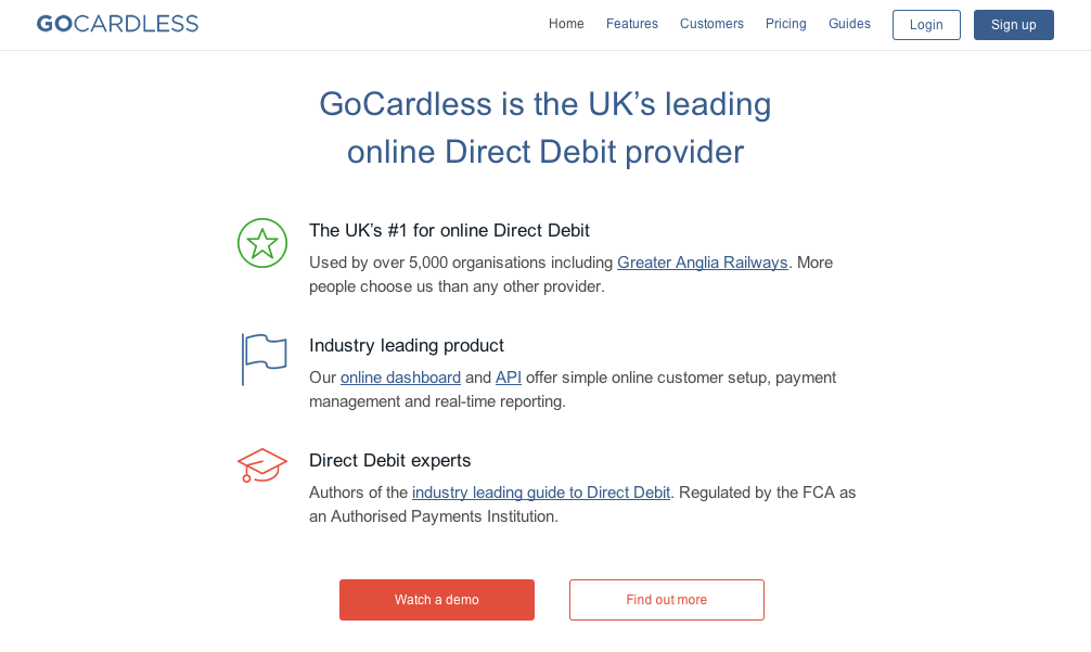
Your call-to-action button prompts your visitor to take the action you want. Many times, you need to test to see what your audience prefers. For instance, GoCardless tested 2 calls to action “Request a demo” and “Watch a demo” on its landing page.
The former was the control.
The “Watch a demo” variation had a 139% increase in conversions compared to the control.
6. Lead form fields
When a site user clicks on a call-to-action button, they’re usually shown the lead capture form. You can test the number of form fields to see the variation with the highest conversions.
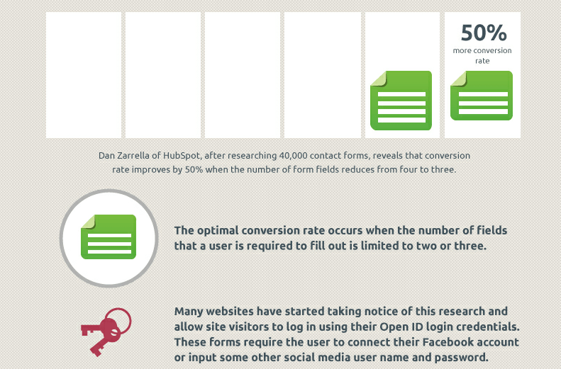
HubSpot’s Dan Zarrella, in his research, found that reducing the form field from 4 to 3 increases conversion rate by 50%
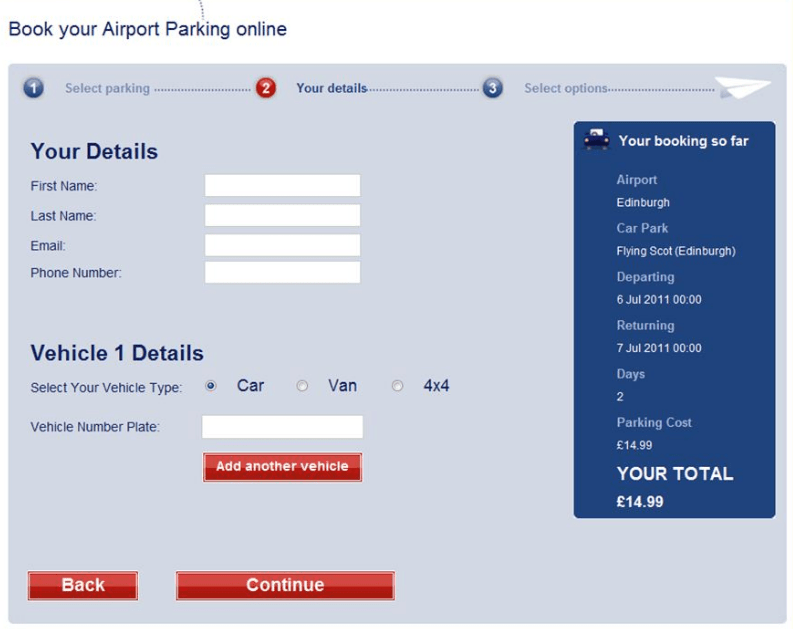
A Glasgow Airport parking resource, Flying Scot Parking, performed a test to reduce the number of its form fields. The control is shown below.
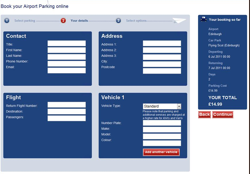
With the fewer form fields, the company had a 35% increase in the number of submissions.
Conclusion
When creating a landing page, you should think about increasing your leads and sales.
By following the steps in this guide, you can achieve the aim of your landing page and grow a successful business online.